Maas Theater
Maas is a Rotterdam-based theater and dance company that creates theater and dance experiences for children, teenagers, young adults, and their families and friends.All their productions, and the guest-performances as well, are well aligned with that eager, bold, and vulnerable target audience. And, of course, their new website should have that same dynamic experience.
Role: Product design, UX strategist
Focus: UX design, UI design
Year: 2022
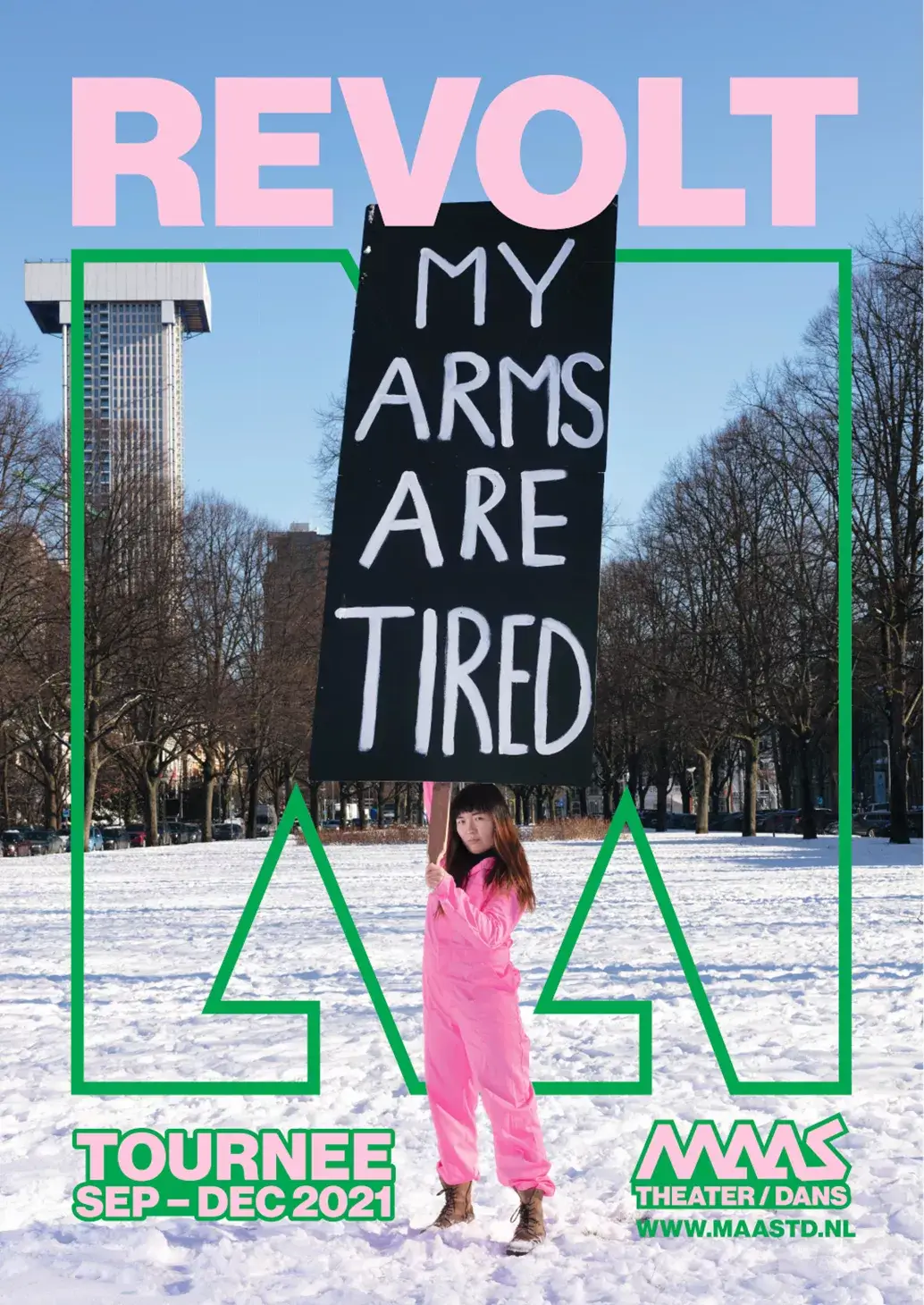
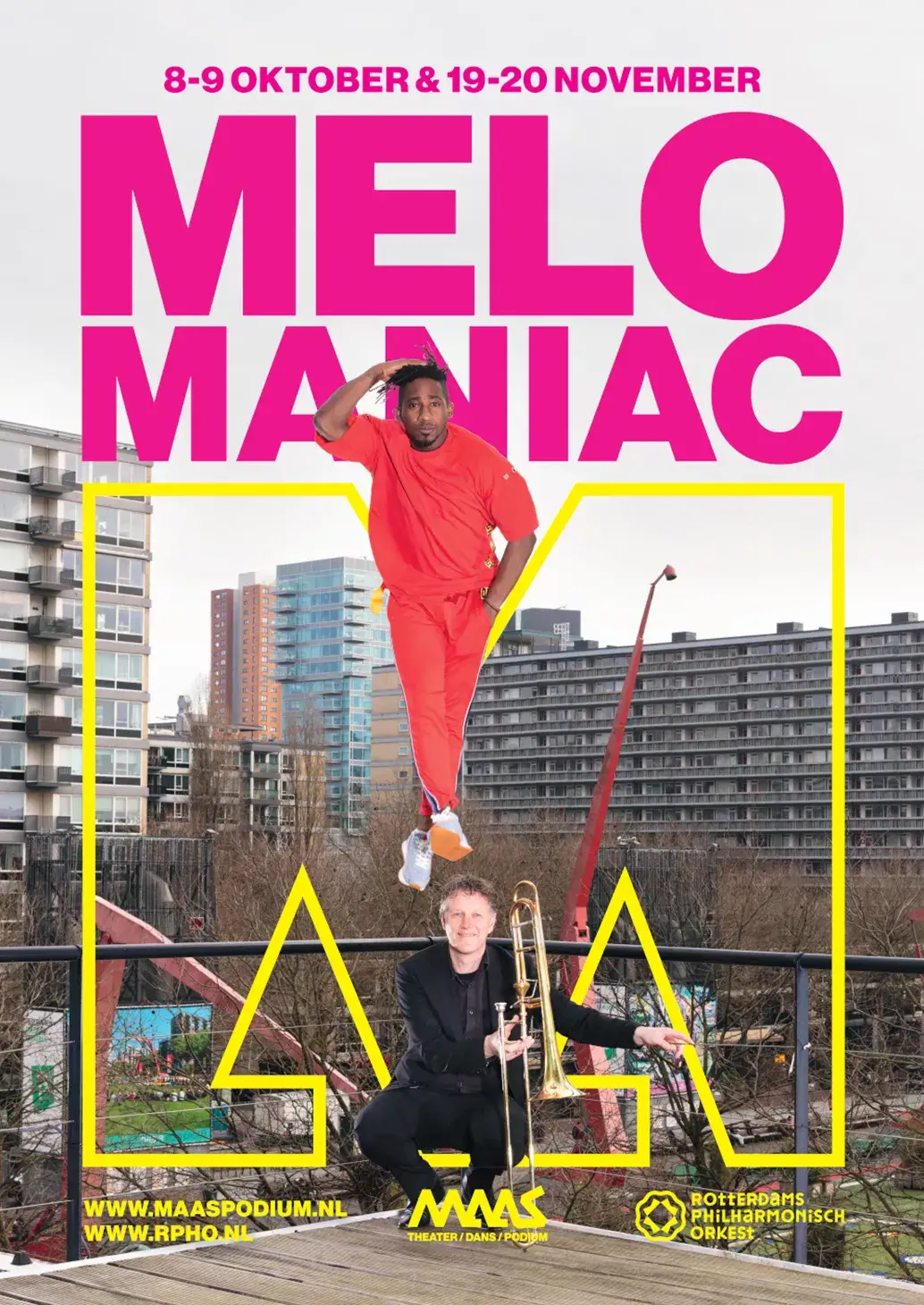
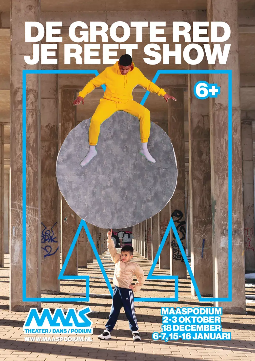
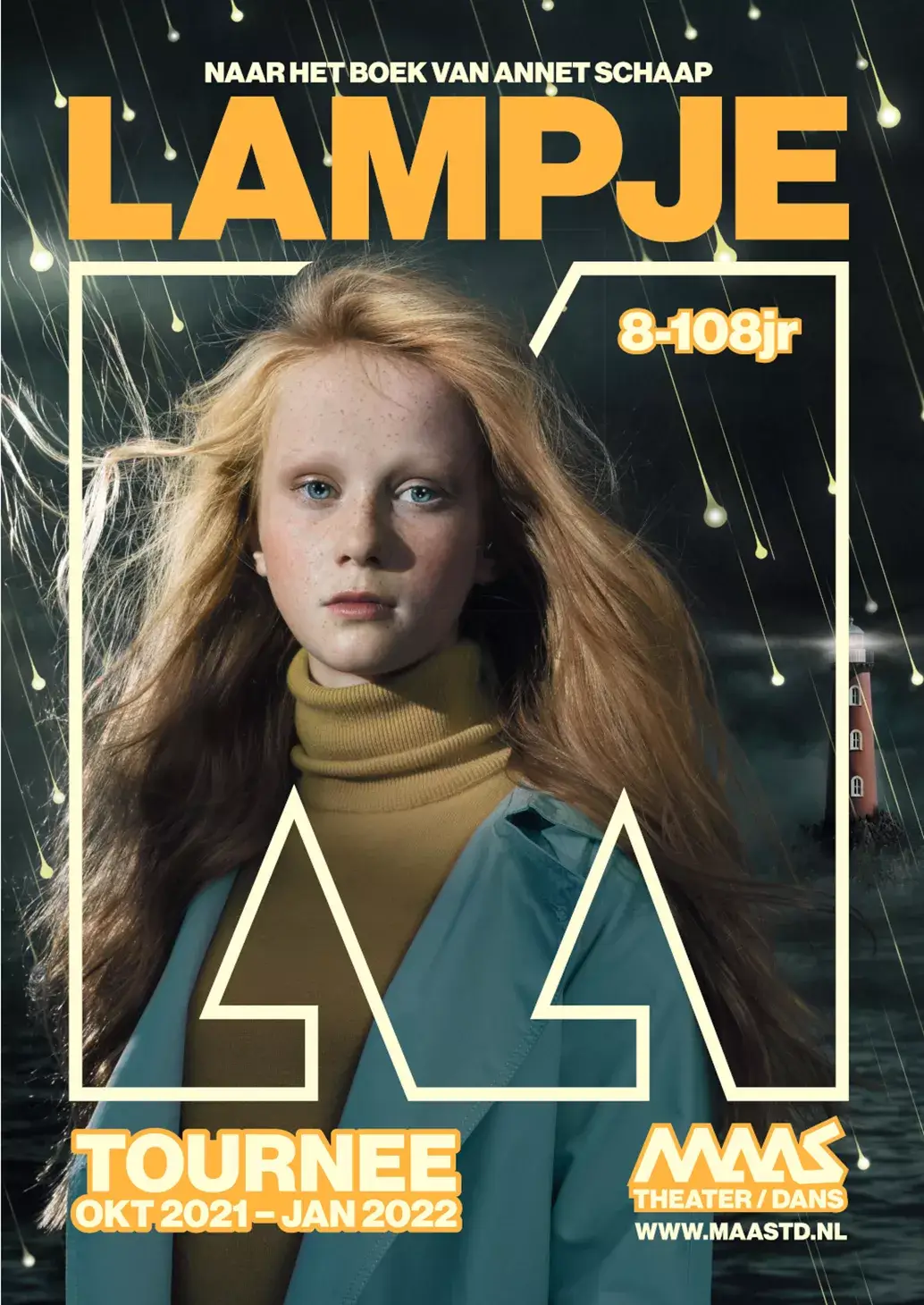
‘M’ stands for Maas.
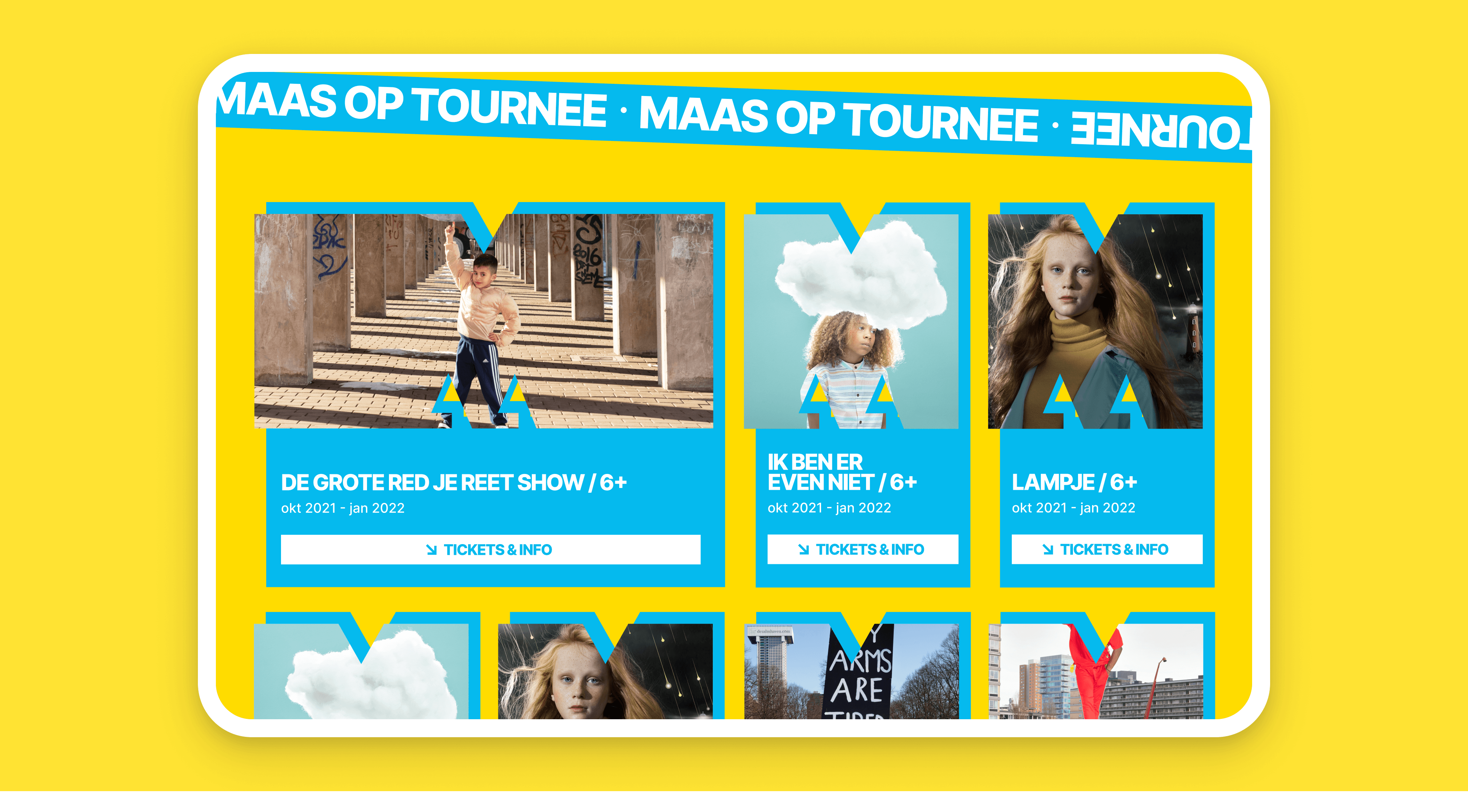
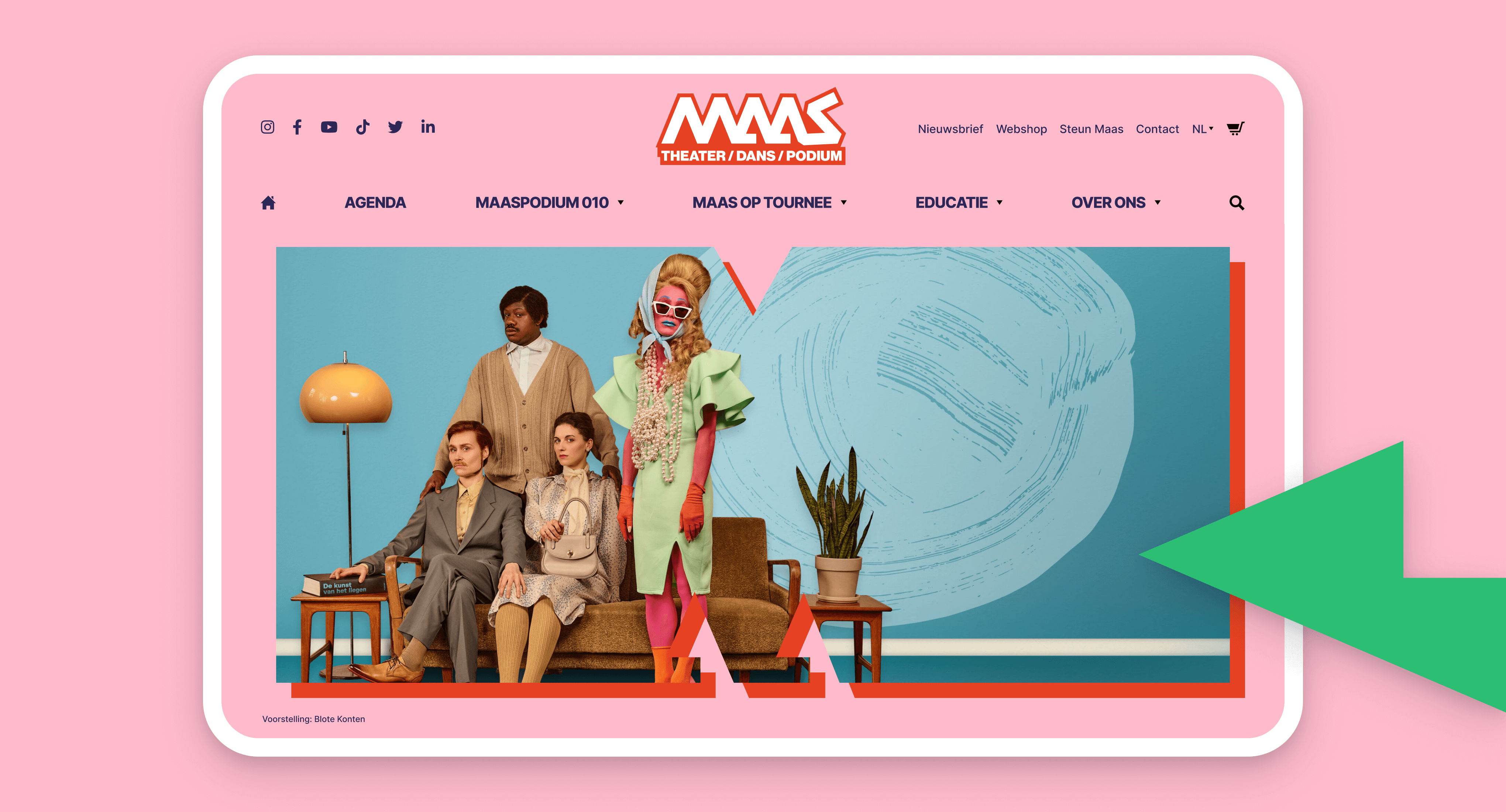
The new company style, created by Vormlust, is colourful, modern, flexible, disruptive, edgy, open, layered, but most of all, it's where art and ‘normal life’ meet each other. The ‘M’ for Maas is the main character of the show and will be displayed in several ways: dancing in videos, static as a shape, or subtle in the background.
Optimized to help customers find their favorite show.
Besides the look and feel, the overall user experience was an important part of the design, maybe the most important part. With this in mind, we designed a website that was optimized to help customers find their favorite theater or dance performance as well as the main call to action in the simplest way possible, while maintaining the iconic style.
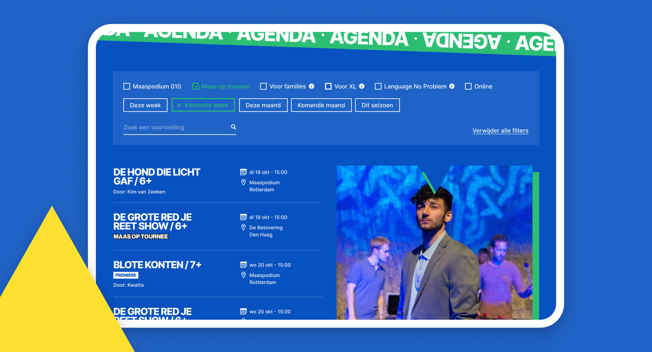
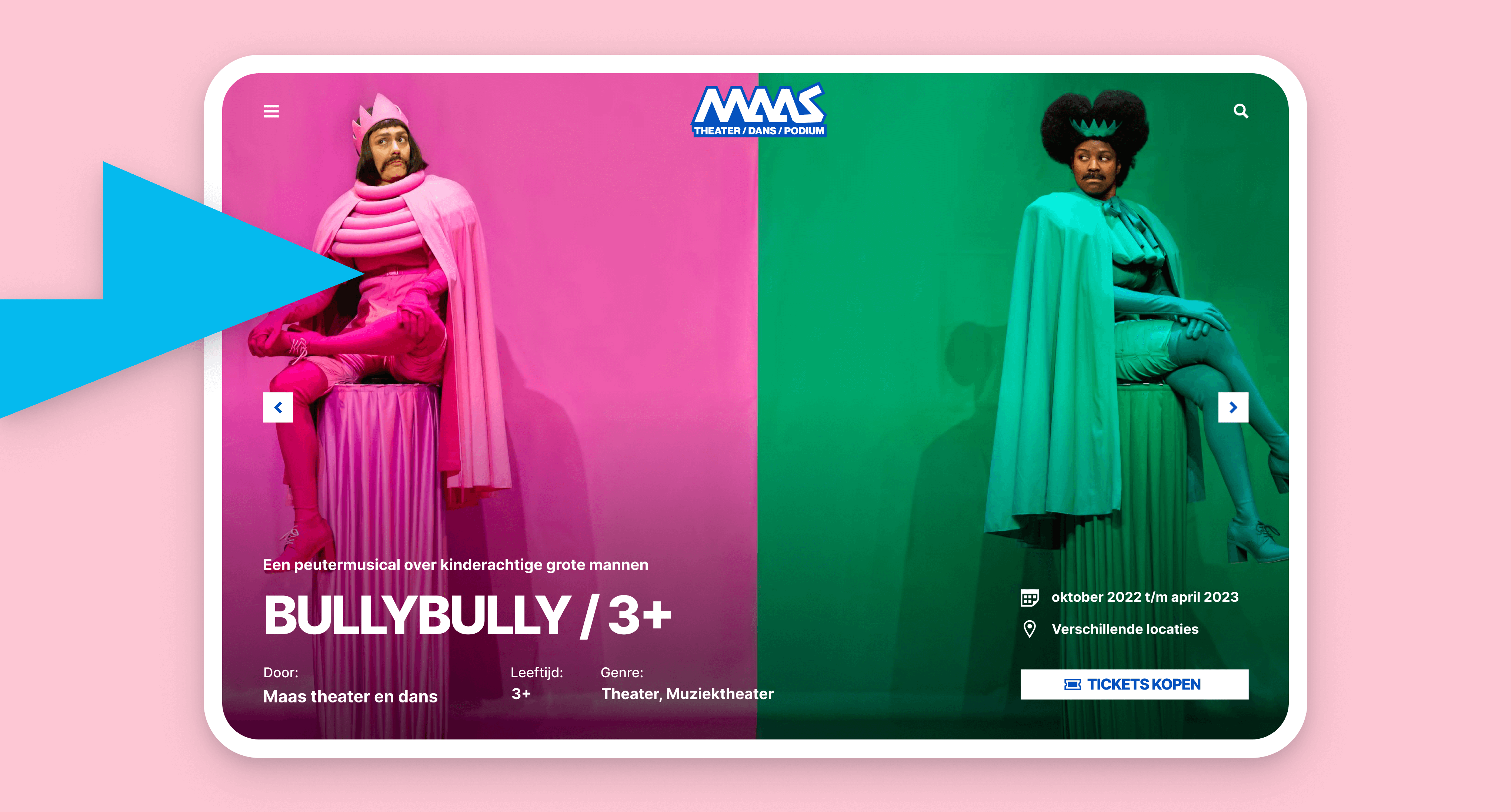
Theater and dance performances in the spotlight.
Every performance puts lots of effort into shooting pictures and creating other visuals that define them. That’s why we created detail pages without any distractions, so that the theater and dance performances are in the spotlight. The result is an uncompromising experience and, of course, increased conversion in the end.
