Odido
What began as a well-guarded secret swiftly evolved into a colossal project. Together with Code d'Azur and more than five other agencies, I worked for months on the new digital experience of the true Dutch brand Odido, which includes a wide range of channels, like platforms, from emails and television to billboards, apps, and websites. With more than 7 million end-users, top-notch colleagues, and a high-quality end result, this is a project that I’m very proud of.
Role: Product designer
Focus: UX design, UI design, Mobile design, UX research, stakeholder management, concept development, prototyping
Agency: Code d’Azur & TBWA
Year: 2023
The most human network.
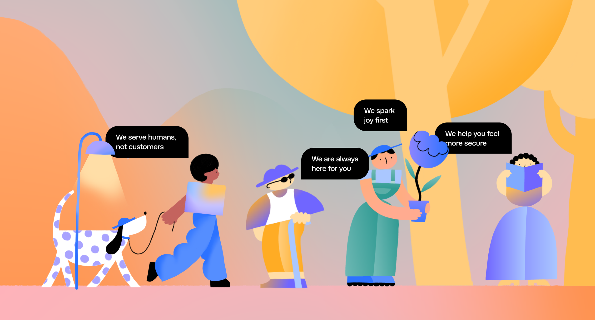
Odido wants to break the cycle of old-fashioned, straightforward telco communication. That’s why their mission is to become the most human network. Within all their channels, they want to serve humans, not customers. They want to be there for their users, spark joy first, and help them feel secure. Based on these core values, we redesigned the total digital experience.
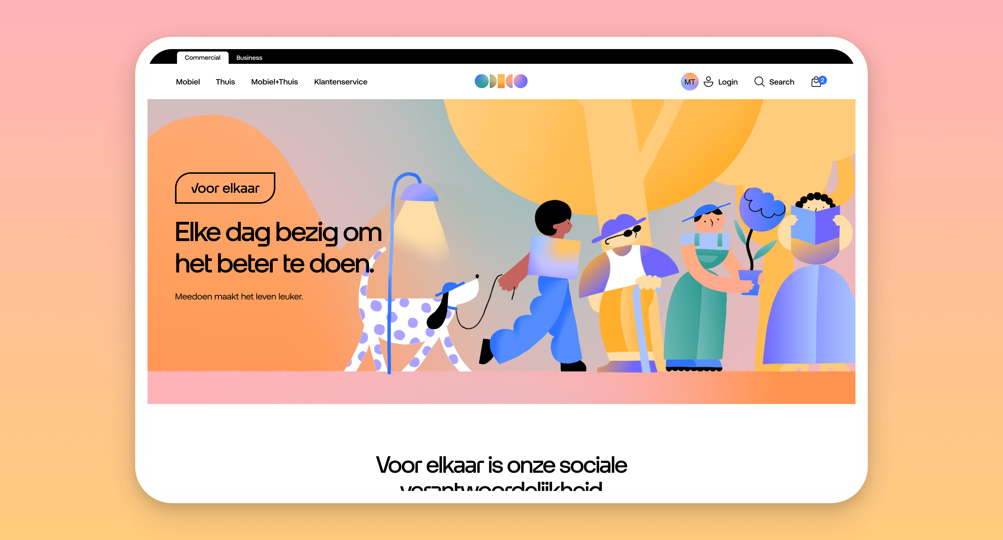
During my time, my main areas of focus revolved around enhancing the human aspect of the digital experience. This involved the implementation of conversational design and 'Voor elkaar', which is where Odido demonstrates their commitment to making technology more humane by sharing their efforts.
Let’s talk about Conversational UX.
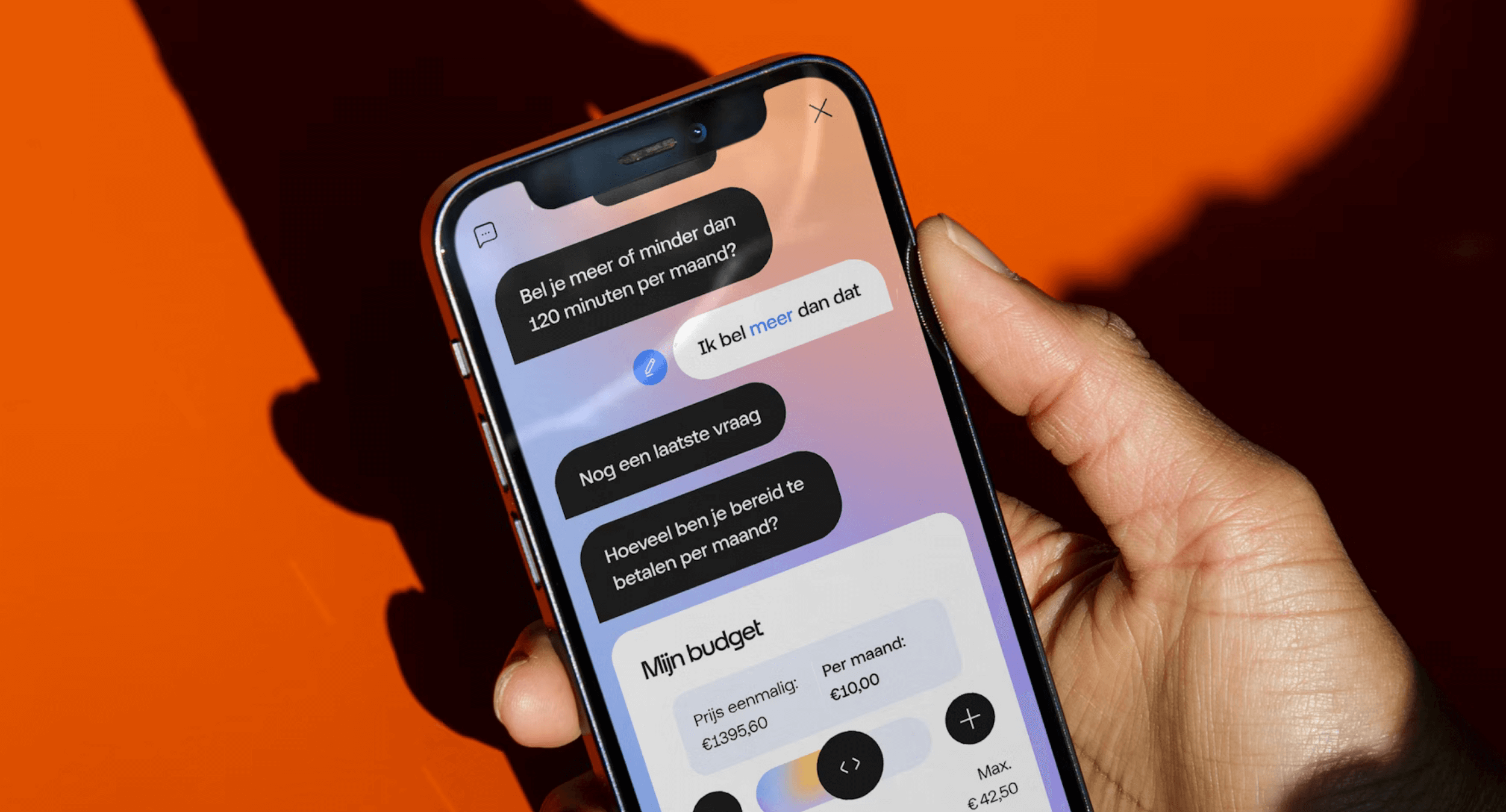
Simply put, the purpose of conversational UX is to make it feel like you're having a natural chat with a computer. You type or talk, and it understands what you're saying and gives you the information or help you need. Overall, it's an essential part of making sure people have intuitive and seamless interactions when they communicate with brands.
My job was to redesign and integrate Conversational UX in the tool that helps the user choose a subscription and phone that best suit their needs. In the first phase, the user follows a decision tree in a conversational style, which eventually leads to a relevant answer or a product. Later, the system proactively establishes connections between data points, including usage, demographics, and dates. In this phase, user input is redundant because the system makes educated guesses based on the datepoints and provides relevant suggestions. In the final phase, the AI is personalised and natural, mimicking human behavior. It is proactive, interactive, and supports both text and speech.
Doing something good for society.
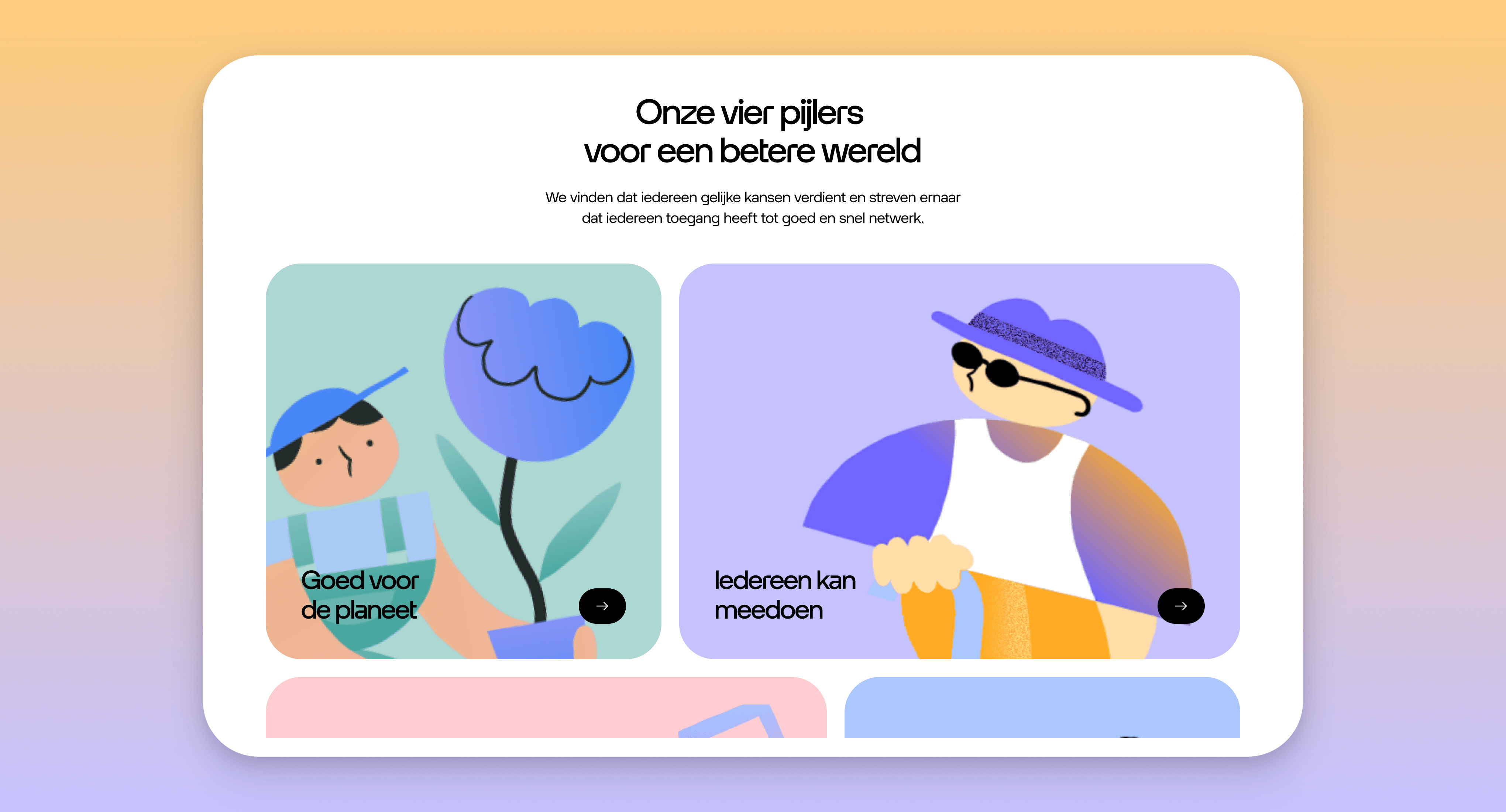
Odido is a socially responsible organisation and has lots of good initiatives to do something good for society. The only problem is that it’s not visible or recognised. By creating a fully new branding, complete with logo and illustation, and digital experience for this campaign, we created a environment where the user can read about all the social and sustainable activities that Odido initiated.
Final thoughts.
It was amazing to get an opportunity to be part of designing a new Dutch brand of this scale and despite the high pressure, I enjoyed this project very much. It was lots of fun to work together with so many talented professionals. Together, we created hundreds, maybe thousands of pages, but the the immersive design system made it much more practical. It contained custom-made icons, as well as custom typography which was developed from scratch, and a seamlessly integrated motion system.